Unleashing Creativity: Unexpected Color Palettes in Fabric Choices for Weddings
Unleashing Creativity: Unexpected Color Palettes in Fabric Choices for Weddings
Introduction
Weddings are a celebration of love and unity, often characterized by traditional themes and color schemes. However, a growing trend among modern couples is to explore unexpected color palettes in fabric choices. This article delves into the captivating world of unconventional colors, offering insights and inspiration for those looking to break away from the norm for their special day.
Why Opt for Unexpected Color Palettes?
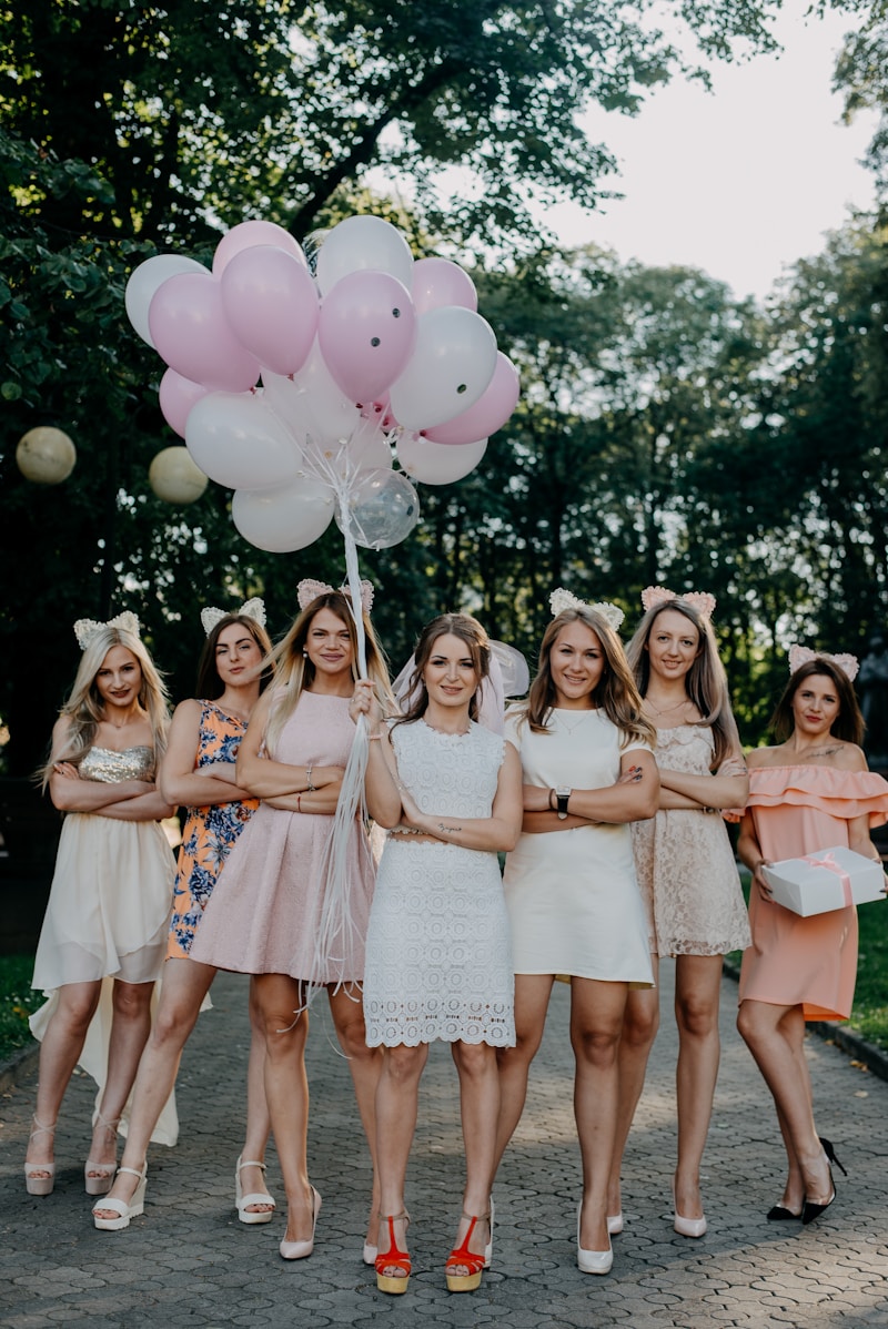
Embracing unexpected color palettes allows couples to express their unique personalities and stand out on their big day. Traditional wedding colors often include whites, creams, soft pinks, and muted pastels. These colors evoke a classic aesthetic but can also feel predictable. By choosing bold and surprising hues, couples can infuse their celebrations with creativity and individuality.
The Psychology of Color in Weddings
Colors have a profound impact on emotions and perceptions. Strong colors can evoke feelings of excitement and joy, while softer hues may convey calmness and romance. Here are some insights into the feelings associated with various colors:
| Color | Emotion | Common Usage |
| Turquoise | Tranquility and peace | Beach-themed weddings |
| Deep Plum | Luxe and sophistication | Fall and winter ceremonies |
| Coral | Warmth and joy | Summer celebrations |
| Mustard Yellow | Cheerfulness | Rustic weddings |
| Electric Blue | Confidence and energy | Modern, urban weddings |
Popular Unexpected Color Combinations
Exploring unusual color combinations can elevate wedding aesthetics and leave a lasting impression. Here are some trending unexpected palettes that can inspire future brides and grooms:
1. Navy and Blush
The classic pairing of navy blue and blush pink is unexpected yet sophisticated. The deep tones of navy create a beautiful contrast with the soft blush, making it a fantastic choice for evening weddings. Fabric options include navy satin with blush tulle overlays for a romantic vibe.
2. Olive and Terracotta
For couples leaning towards a rustic or bohemian theme, the combination of olive green and terracotta is a match made in heaven. Consider using these colors in your table settings with terracotta dinnerware and olive-green organizers to enhance the earthiness of the decor.
3. Charcoal and Mustard
This contrast brings a modern edge to wedding aesthetics. The dark, moody charcoal can be balanced with bright, cheerful mustard for an eye-catching look. Think table runners in charcoal with must-have floral arrangements featuring yellow blooms.
Choosing Fabrics That Elevate Color
Once you’ve decided on a color palette, choosing the right fabrics to reflect those colors is essential. Different materials can enhance or soften colors, adding depth and texture to the overall design. Here are some popular fabric choices:
1. Silk
Silk reflects light beautifully, making colors appear more vibrant. It’s an ideal choice for luxurious bridal gowns or elegant table linens. Silk's sheen can elevate unexpected hues, ensuring that the colors pop.
2. Velvet
Velvet is perfect for cooler months, adding an element of warmth and richness. Darker tones, such as deep emerald or burgundy, really shine in this fabric. Imagine velvet drapes or table settings that invite guests into a cozy ambiance.
3. Tulle
This airy fabric is perfect for incorporating unexpected color palettes subtly. Light tulle overlays in blushing pink or soft lavender can create a beautiful ethereal effect while allowing for bolder color choices underneath.
Tips for Implementing Unexpected Colors
Integrating unexpected colors into a wedding can be challenging but rewarding. Here are some tips to help couples smoothly incorporate these hues:
1. Start Small
If you’re unsure about diving headfirst into bold colors, start by incorporating them into smaller details. Think about your invitations, table settings, or floral arrangements. These elements can introduce your color palette without overwhelming the overall aesthetics.
2. Balance is Key
When working with unexpected palettes, it’s essential to find balance. Use neutral colors as a base to help stabilize and ground the vibrancy of bold hues. This approach ensures that no single color overtakes the overall look.
3. Use Lighting to Your Advantage
Lighting plays a crucial role in how colors are perceived. Soft, warm lighting can enhance softer colors, while brighter, cooler light can make bold colors pop. Experimenting with different lighting setups will help in achieving the desired atmosphere.
Conclusion and Final Thoughts
Choosing unexpected color palettes in fabric choices for weddings is about embracing creativity and self-expression. Modern couples are ditching traditional norms in favor of vibrant, personalized themes that truly reflect their unique love stories. Prioritize what feels right for you and your partner, and don't shy away from experimenting with fabric and color. Remember, the day is a celebration of your love, so let your colors shine!
As you plan your wedding, keep in mind not just the color palettes but the feelings and memories they evoke—your choices will leave a lasting impression, not just for you but for everyone present. Explore, experiment, and enjoy crafting the wedding of your dreams!
To summarize, unexpected color palettes bring a fresh perspective to wedding decor and fabric choices, and they are an excellent way to personalize your ceremony. So, what unconventional colors are you considering for your wedding?
